Wednesday, November 21, 2012

Building a New Image Format

There’s now a newcomer to the stable of images we use for web development. It’s the WebP Image Format (see https://developers.google.com/speed/webp/)


WebP’s goal is to surpass compression file sizes of photographs—a role usually reserved by JPEG. But this JPEG clone has a special talent: animation! So, in essenece, the WebP image format is a hybrid of the GIF and JPEG file format.

The downside to new image formats is their historically slow adoption rate. While transparency support in the PNG format is an obviously amazing benefit for any web designer, Internet Explorer took about four years to support it after the other major browsers did. As of this writing, Mozilla is not yet supporting the WebP format. The benefits of WebP image format seems to merely replace existing features of the GIF and JPEG formats without adding anything new of substance, while it brings in a host of browser compatibility headaches for web designers and developers that could last years.

There are 20+ polyfills for adaptive images with their pros and cons, a couple of which I’ve had a hand in writing. But all these solutions are not solving the real problem. And that problem is that today’s popular raster image formats—PNG, JPEG, GIF—can’t be both low resolution and high resolution at the same. We need an image file format that is, in essence, a storage locker.

Storing Resolutions

The popular .mp3 file format isn’t just any bits of ones and zeros detailing music. It’s actually a meta data information inside an audio tag. This is where, for example, in iTunes record song information like song title, artist, album title, year the song came out and so on.

We need to have a file format for images that’s similar. Instead of capturing meta information for the image, we store different variations of the image. One “image” file might be able to contain a thumbnail image, a mobile friendly image, desktop friendly version, retina display version, and print-friendly image. This responsive image format isn’t something that’s a dream. An image file format already exists that does this called FlashPix.

Developed in 1996 by partners like Eastman Kodak, Micrsofot and Hewlett-Packard, the image file format was ahead of its time.

Benefits of Responsive Image Format

A responsive image format allows the continued use of the img element which is ingrained into the bones, the very marrow, of the Web. There isn’t a need to craft multiple lines of HTML to make one image show up in a web page. Secondly, there’s a simple reason why strict coding styles of XHTML was abandoned and loose HTML4 coding practices were instilled into HTML5—95% of websites don’t validate.

Asking web designers, bloggers, and non-techies to create multiple versions of their images in order to appease every Android, iOS device and desktop browser seems not only like a very non-standards approach, it’s also not a very practical one. Content producers that work with the web at least a little bit know the fundamental one-to-one aspect when it comes to publishing images on the web: one img element somewhat coded correctly results in one image showing up in the browser.

If we go with a solution born from the kin of video and audio elements–where we do need to balance differing file supoprt due to the browser venders’ turf wars and licensing issues, I believe we surrender a bit of the Open Web mentality for not much gain.

Content Publishers That Don’t Code

Another issue is that with a method for inserting images with additional markup means there needs to be widespread change in WYSIWYG editors, their respetive tool bars in Content Management Systems, updated old web pages. That simply is not going to happen. There need something on mini-Y2K levels (see http://www.computerworld.com/s/article/9142555/Y2K_The_good_the_bad_and_the_crazy) to get companies and organizations to start spending that sort of capital to fix the issue. And while retina display is cool, I don’t think this issue rises to that level of concern of blink red light, mission critcial as Y2K did for businesses and governments all over the world.

Save Once, Images Everywhere

If given a choice, I believe web designers would rather export one piece of artwork from Fireworks, Photoshop or whatever their favorite image editor of choice happens to be and then let the software compile multiple resolutions into one container file. This container file can then be stored on a server and referenced via an img element in an HTML page. The simple <img> got us this far and it hasn’t failed us yet. Let’s look to make image formats work smarter, work better by building smarter browsers and servers.

The web needs an image format that, when asked by a browser the server would deliver the right image that contains the right resolution. We need an image format that can work in tandem with server and browser to determine the approprirate resolution. A new image format for web design isn’t impossible. It just feels like that sometimes.

Posted on 1:53 AM | Categories:

Tuesday, November 20, 2012

JavaScript Devs: Be Careful With Comparison Operators

The results of type coercion in JavaScript can be difficult to predict, even when you know the rules. In this post, we will see how subtle differences in comparisons, can lead to significant changes in the results. Be careful when relying on 'truthyness' for logic. Whenever possible, use comparison operators to clarify your meaning. 'Falsy' values include:

0
undefined
null
empty strings
false

CAUTION - Boolean objects instantiated with new Boolean(false) are 'truthy' because they're objects, and objects are truthy! In order to test against them, you need to use the .valueOf() method. It's better in almost all cases to use true and false, instead.


Empty objects and empty arrays are truthy, including objects created with new Boolean(false).

Wrong: Don't use new Boolean()

var myBool = new Boolean(false);
test('Boolean object', function () {
  ok(!myBool, 'Should be falsy'); // Fails
  ok(!myBool.valueOf(),
    'Should be falsy.'); // Passes
});


Right: Use true or false in your boolean declarations

var myBool = false;
test('Boolean object', function () {
  ok(!myBool, '!myBool should be false.');
});


The following series of tests are meant to demonstrate how different types of comparisons in JavaScript that look similar can deliver very different results.

Always be careful that you're using the correct test for your situation:

function truthy(x) {
  if (x) {
    return true;
  } else {
    return false;
  }
}


test('Truthy', function () {
  // Falsy
  equal(truthy(0), true, 'truthy(0)'); // Fail
  equal(truthy(''), true, "truthy('')");  // Fail
  equal(truthy(null), true, 'truthy(null)'); // Fail
  equal(truthy(undefined), true,
    'truthy(undefined)'); // Fail
  equal(truthy(false), true, 'truthy(false)'); // Fail

  // Truthy
  equal(truthy('0'), true, "truthy('0')"); // Pass
  equal(truthy(new Boolean(false)), true,
    'truthy(new Boolean(false))'); // Pass
  equal(truthy({}), true, 'truthy({})'); // Pass
  equal(truthy([]), true, 'truthy([])'); // Pass
  equal(truthy([0]), true, 'truthy([0])'); // Pass
  equal(truthy([1]), true, 'truthy([1])'); // Pass
  equal(truthy(['0']), true, "truthy(['0'])"); // Pass
  equal(truthy(['1']), true, "truthy(['1'])"); // Pass
});


These are the falsy and truthy values we'll use as a baseline for a series of other comparisons.

CAUTION - Often, developers will use if (x) when they really want to see if the value has been set at all. This is especially problematic when 0, empty strings, or false are valid values. In that case, you want the test to pass as long as the expression evaluates to anything other than null or undefined. A good rule of thumb is to only use if (x) to evaluate booleans or the existence of objects or arrays.

function exists(x) {
  if (x !== undefined && x !== null) {
    return true;
  } else {
    return false;
  }
}


test('exists', function () {
  // Falsy
  equal(exists(0), true, 'exists(0)'); // Pass
  equal(exists(''), true, "exists('')"); // Pass
  equal(exists(null), true, 'exists(null)');
  equal(exists(undefined), true, 'exists(undefined)');
  equal(exists(false), true, 'exists(false)'); // Pass

  // Truthy
  equal(exists('0'), true, "exists('0')"); // Pass
  equal(exists(new Boolean(false)), true,
    'exists(new Boolean(false))'); // Pass
  equal(exists({}), true, 'exists({})'); // Pass
  equal(exists([]), true, 'exists([])'); // Pass
  equal(exists([0]), true, 'exists([0])'); // Pass
  equal(exists([1]), true, 'exists([1])'); // Pass
  equal(exists(['0']), true, "exists(['0'])"); // Pass
  equal(exists(['1']), true, "exists(['1'])"); // Pass
});


Of course, a shorter version of that function will return the same results:

function exists(x) {
  return (x !== undefined && x !== null);
}


CAUTION - The == operator can return some problematic results due to type coercion.

For example, say you're checking an array to be sure it contains a valid price, and some items cost $0.00. Your code could fail because ['0.00'] == false. Use === instead.

var isFalse = function isFalse(x) {
  return (x == false);
};


test('isFalse using ==', function () {
  // Falsy
  equal(isFalse(0), true, 'isFalse(0)'); // Pass
  equal(isFalse(''), true, "isFalse('')"); // Pass
  equal(isFalse(null), true, 'isFalse(null)'); // Fail
  equal(isFalse(undefined), true, 'isFalse(undefined)'); // Fail
  equal(isFalse(false), true, 'isFalse(false)'); // Pass


  // Truthy
  equal(isFalse('0'), true, "isFalse('0')"); // Pass
  equal(isFalse(new Boolean(false)), true,
    'isFalse(new Boolean(false))'); // Pass
  equal(isFalse({}), true, 'isFalse({})'); // Fail
  equal(isFalse([]), true, 'isFalse([])'); // Pass
  equal(isFalse([0]), true, 'isFalse([0])'); // Pass
  equal(isFalse([1]), true, 'isFalse([1])'); // Fail
  equal(isFalse(['0']), true, "isFalse(['0'])"); // Pass
  equal(isFalse(['1']), true, "isFalse(['1'])"); // Fail
});


The following code will only return true if x is actually set to false:

var isFalse = function isFalse(x) {
  return (x === false);
};


The following function is dangerous, because it will return true for 1, [1], and ['1'].

var isTrue = function isTrue(x) {
  return (x == true);
};


Use === instead to eliminate the possibility of false positives.

Remember that if (x) will always return true when x is an object -- even if the object is empty. It's common to use ducktyping when you examine objects. (If it walks like a duck and talks like a duck, treat it like a duck.) The idea is similar to using feature detection in browsers, instead of running checks against the browser string. Ducktyping is feature detection for objects.

if (typeof foo.bar === 'function') {
  foo.bar();
}


Wednesday, October 24, 2012

Why are Deferred Objects So Useful


Deferred objects are useful when you want to execute functions at the end of some task without having to monitor that task directly, especially when that task is being performed in the background. The code below contains a demonstration, which I’ll then start to modify to add features. It's about using Callbacks with a Long-Lived Task

...
<script type="text/javascript">
$(document).ready(function() {
var def = $.Deferred();
def.done(function() {
displayMessage("Callback Executed");
})
function performLongTask() {
var start = $.now();
var total = 0;
for (var i = 0; i < 500000000 ; i++) {
total += i;
}
var elapsedTime = (($.now() - start)/1000).toFixed(1)
displayMessage("Task Complete. Time: " + elapsedTime + " sec")
def.resolve();
}
$('button').button().click(function() {
displayMessage("Calling performLongTask()")
performLongTask()
displayMessage("performLongTask() Returned")
})
displayMessage("Ready")
})
function displayMessage(msg) {
$('tbody').append("<tr><td>" + msg + "</td></tr>")
}
</script>
...

The process in this example is defined by the performLongTask function, which adds together a series of numbers. I want something simple that takes a few seconds to complete, and this fits the bill.

Tip: On my system, the for loop in the performLongTask function takes about 3.5 seconds to complete, but you may need to adjust the upper limit for the loop to get a similar result on your system. Three to four seconds is a good duration for these examples. It’s long enough to demonstrate the deferred object features but not so long that you have time to make coffee while waiting for the task to complete.

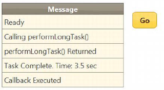
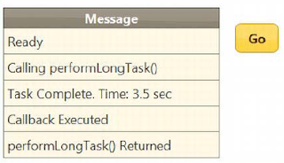
Clicking the button now calls the performLongTask function. That function calls the deferred object’s resolve method when its work is complete, causing the callback function to be invoked. The performLongTask function adds its own message to the table element before it calls resolve, so you can see the sequence of progression through the script. You can see the results:


This is an example of a synchronous task. You push the button, and then you have to wait while each function that you call completes. The best indicator that you are working synchronously is the way that the Go button stays in its pressed state while the performLongTask function does its work. Definitive proof comes in the sequence of messages displayed in the image shown here. The messages from the click event handler come before and after the messages from performLongTask and the callback functions.

The major benefit of deferred objects comes when you are working with asynchronous tasks, tasks that are being performed in the background. You don’t want the user interface to lock up like it did in the previous example, so you start tasks in the background, keep an eye on them, and update the document to give the user information about the progress and result of the work.


The simplest way to start a background task is to use the setTimeout function, which means that you are using yet another callback mechanism. This may seem a little odd, but JavaScript lacks the language facilities for managing asynchronous tasks that other languages are designed with, so you have to make do with those features that are available. The code shows the example modified

...
<script type="text/javascript">
$(document).ready(function() {
var def = $.Deferred();
def.done(function() {
displayMessage("Callback Executed");
})
function performLongTask() {
setTimeout(function() {
var start = $.now();
var total = 0;
for (var i = 0; i < 500000000 ; i++) {
total += i;
}
var elapsedTime = (($.now() - start)/1000).toFixed(1)
displayMessage("Task Complete. Time: " + elapsedTime + " sec")
def.resolve();
}, 10);
}
$('button').button().click(function() {
displayMessage("Calling performLongTask()")
performLongTask()
displayMessage("performLongTask() Returned")
})
displayMessage("Ready")
})
function displayMessage(msg) {
$('tbody').append("<tr><td>" + msg + "</td></tr>")
}
</script>
.....

I use the setTimeout function to perform the for loop in the performLongTask function after a delay of 10 milliseconds. You can see the effect this has in the image below. Notice that the messages from the click handler function appear before those from the performLongTask and callback functions. If you run this          example yourself, you will notice that the button pops back into its regular state immediately, rather than waiting for the work to complete.

Callbacks are particular important when working with background tasks because you don’t know when they are complete. You could set up your own signaling system—updating a variable, for example—but you would need to do this for every background task that you perform, which becomes tiresome and error-prone very quickly. Deferred objects allow you to use a standardized mechanism for indicating that tasks have completed, and as I’ll demonstrate in later examples, they offer a lot of
flexibility in how this is done.

Can we do better?

Before you start digging into the feature of deferred objects, I am going to update the example to use the pattern that I tend to work with in real projects. This is purely personal preference, but I like to split out the workload from the asynchronous wrapper and integrate the production of the deferred object into
the function. The code shows the changes.

<!DOCTYPE html>
<html>
<head>
<title>Example</title>
<script src="jquery-1.7.js" type="text/javascript"></script>
<script src="jquery-ui-1.8.16.custom.js" type="text/javascript"></script>
<link rel="stylesheet" type="text/css" href="styles.css"/>
<link rel="stylesheet" type="text/css" href="jquery-ui-1.8.16.custom.css"/>
<style type="text/css">
td {text-align: left; padding: 5px}
table {width: 200px; border-collapse: collapse; float: left; width: 300px}
#buttonDiv {text-align: center; margin: 20px; float: left}
</style>
<script type="text/javascript">
$(document).ready(function() {
function performLongTaskSync() {
var start = $.now();
var total = 0;
for (var i = 0; i < 500000000 ; i++) {
total += i;
}
var elapsedTime = (($.now() - start)/1000).toFixed(1)
displayMessage("Task Complete. Time: " + elapsedTime + " sec")
return total;
}
function performLongTask() {
return $.Deferred(function(def) {
setTimeout(function() {
performLongTaskSync();
def.resolve();
}, 10)
})
}
$('button').button().click(function() {
if ($(':checked').length > 0) {
displayMessage("Calling performLongTask()")
var observer = performLongTask();
observer.done(function() {
displayMessage("Callback Executed");
});
displayMessage("performLongTask() Returned")
} else {
displayMessage("Calling performLongTaskSync()")
performLongTaskSync();
displayMessage("performLongTaskSync() Returned")
}
})
$(':checkbox').button();
displayMessage("Ready")
})
function displayMessage(msg) {
$('tbody').append("<tr><td>" + msg + "</td></tr>")
}
</script>
</head>
<body>
<h1>Jacqui's Flower Shop</h1>
<table class="ui-widget" border=1>
<thead class="ui-widget-header">
<tr><th>Message</th></tr>
</thead>
<tbody class="ui-widget-content">
</tbody>
</table>
<div id="buttonDiv">
<button>Go</button>
<input type="checkbox" id="async" checked>
<label for="async">Async</label>
</div>
</body>
</html>

In this example, I have broken out the workload into a function called performLongTasksync, which is just responsible for performing the calculations. It has no knowledge of background tasks or callback functions. I like to keep the workload separate because it makes testing the code easier during the early stages of development. Here is the synchronous function:

function performLongTaskSync() {
var start = $.now();
var total = 0;
for (var i = 0; i < 500000000 ; i++) {
total += i;
}
var elapsedTime = (($.now() - start)/1000).toFixed(1)
displayMessage("Task Complete. Time: " + elapsedTime + " sec")
return total;
}

I have separated out the code to perform the task asynchronously. This is in the performLongTask function, which is an asynchronous wrapper around the  performLongTasksync function and which uses a deferred object to trigger callbacks when the work has completed. Here is the revised performLongTask function:

function performLongTask() {
return $.Deferred(function(def) {
setTimeout(function() {
performLongTaskSync();
def.resolve();
}, 10)
})
}

If pass a function to the Deferred method, it is executed as soon as the object is created, and the function is passed the new deferred object as a parameter. Using this feature, I can create a simple wrapper function that performs the work asynchronously and triggers the callbacks when the work has finished.

If you are observant, you will have noticed that there is a chance that calling the done method to register a callback function may occur after the task has been completed and the resolve method has been called. This may occur for very short tasks, but the callback function will still be called, even if done is called after resolve.

The other reason that I like to create a wrapper like this is because deferred objects can’t be reset once they are resolved or rejected (I explain rejection in a moment). By creating the deferred object inside of the wrapper function, I ensure that I am always using fresh, unresolved deferred objects. The other change I have made to this example is to add a toggle button that allows the task to be performed synchronously or asynchronously. I will take this feature out of future examples  because this is an article about asynchronous tasks, but it is a good way to make sure you are comfortable with the difference. You can see the output from both modes


References:  Wrox Professional jQuery

Thursday, September 20, 2012

To Carousal or Not

In an effort to squeeze more content on web pages, designers sometimes turn to novel navigation features such as carousels that advance or rotate objects in a fixed space. These are great for displaying related products or showing facets of the same product, such as pants presented in different colors or with different tailoring options (cuffed or not, straight vs. relaxed cut, etc.). Some carousels are relatively simple slide-show-like implementations, while others present selectable objects in a 3-D, circular view.

For ThanksGiving, I am offering 5 exclusive website templates for just $3.99. Purchase Here.


This carousel, used on Amazon.com, effectively displays related products within a small space.  It clearly communicates the total number of pages or items available.

When using novel interaction such as a carousel, web site designers and content writers need to remember usability basics such as reinforcing a sense of place and keeping users in control. For example, common usability problems we have seen with carousels include:

1. Users can easily lose track of what they have previously viewed when sites do not display how many items or sets of items exist or their current location within the set.


This type of carousel makes users work harder to remember which items they have previously viewed, especially if items are not visually distinctive or otherwise memorable.

One site we tested displayed content below the carousel when an item was selected. Users were not always aware of which item was selected, and some did not associate the dynamic content with the carousel selection at all.

2. Complex navigation within a carousel can be very problematic. Rich navigation is possible using a carousel model, whereby the carousel changes “pages” that each present their own set of navigation opportunities via links or embedded objects.  We have seen users become lost or miss key messages within this type of navigation scheme.  Interaction designers need to take extra care to convey location and navigation options through labels, headings, and other visual cues.

Posted on 1:23 AM | Categories:

Tuesday, September 18, 2012

Some IE CSS Tips for Transparency, min-max width and Conditional Comments


You can force IE to apply transparency to PNGs. In theory, PNG files do support varied levels of transparency; however, an Internet Explorer 6 bug prevents this from
working cross-browser.

1. #regular_logo
2. {
3. background:url('test.png'); width:150px; height:55px;
4. }
5. /* \ */
6. * html #regular_logo
7. {
8. background:none;
9. float:left;
10. width:150px;
filter:progid:DXImageTransform.Microsoft.AlphaImageLoader(src='test.
png', sizingMethod='scale');
11.
12. }
13. /* */

You can define min-width and max-width in IE. You can use Microsoft’s dynamic expressions to do that.

1. #container
2. {
3. min-width: 600px;
4. max-width: 1200px;
width:expression(document.body.clientWidth < 600? "600px" :
document.body.clientWidth > 1200? "1200px" : "auto");
5.
6. }

You can use Conditional Comments for IE. The safest way of taking care of IE/Win is to use conditional comments. It feels more future-proof than CSS hacks – is to use
Microsoft’s proprietary conditional comments. You can use this to give IE/Win a separate stylesheet that contains all the rules that are needed to make it behave properly.

1. <!--[if IE]>
2. <link rel="stylesheet" type="text/css" href="ie.css" />
3. <![endif]-->

Posted on 9:35 PM | Categories:

Tuesday, September 11, 2012

The Dys-Functional Specifications


So what's functional about a Functional Spec?

These blueprint docs usually wind up having almost nothing to do with the finished product. Here's why:

Functional specs are fantasies
They don't reflect reality. An app is not real until builders are building it, designers are designing it, and people are using it. Functional specs are just words on paper.

Functional specs are about appeasement
They're about making everyone feel involved and happy which, while warm and fuzzy, isn't all that helpful. They're never about making tough choices and exposing costs, things that need to happen to build a great app.

Functional specs only lead to an illusion of agreement
A bunch of people agreeing on paragraphs of text isn't a true agreement. Everyone may be reading the same thing but they're thinking something different. This inevitably comes out later on: "Wait, that's not what I had in mind." "Huh? That's not how we described it." "Yes it was and we all agreed on it — you even signed off on it." You know the drill.


Functional specs force you to make the most important decisions when you have the least information
You know the least about something when you begin to build it. The more you build it, the more you use it, the more you know it. That's when you should be making decisions — when you have more information, not less.

Functional specs lead to feature overload
There's no pushback during spec phase. There's no cost to writing something down and adding another bullet point. You can please someone who's a pain by adding their pet feature. And then you wind up designing to those bullet points, not to humans. And that's how you wind up with an overloaded site that's got 30 tabs across the top of the screen.

Functional specs don't let you evolve, change,and reassess
A feature is signed off and agreed on. Even if you realize during development that it's a bad idea, you're stuck with it. Specs don't deal with the reality that once you start building something, everything changes.

So what should you do in place of a spec? Go with a briefer alternative that moves you toward something real. Write a one page story about what the app needs to do. Use plain language and make it quick. If it takes more than a page to explain it, then it's too complex. This process shouldn't take more than one day.


Then begin building the interface — the interface will be the alternative to the functional spec. Draw some quick and simple paper sketches. Then start coding it into html. Unlike paragraphs of text that are open to alternate interpretations, interface designs are common ground that everyone can agree on.

Confusion disappears when everyone starts using the same screens. Build an interface everyone can start looking at, using, clicking through, and "feeling" before you start worrying about back-end code. Get yourself in front of the customer experience as much as possible.

Forget about locked-in specs. They force you to make big, key decisions too early in the process. Bypass the spec phase and you'll keep change cheap and stay flexible.


Posted on 11:40 PM | Categories:

Saturday, August 18, 2012

Who came first - Content or Design


Well, I believe that to make good design you should know what content is. It’s because design is about how to deliver content the right way. On the other hand, not only content matters, but also form of delivery, medium (read “design”) could make a competitive advantage, become a key idea of customer’s business.

But, obviously, it’s not about content only, there is user study, context of usage, company possibilities and business interest. All these things should influence design.

Get as much of the content before designing as you can.

I've long believed that real data delivers really effective design. Using actual content, information, and activity throughout the design process to inform and guide decisions results in product designs that scale well and communicate effectively.

For ThanksGiving, I am offering 5 exclusive website templates for just $3.99. Purchase Here.

This philosophy could be thought of as "death to lorem ipsum". Lorem Ipsum, in case you are wondering, is dummy text originally used in the print industry to lay out page designs. It has since been re-appropriated byWeb designers (and worse yet software designers) to lay out Web site and application designs.

Using dummy content or fake information in the Web design process can result in products with unrealistic assumptions and potentially serious design flaws. A seemingly elegant design can quickly begin to bloat with unexpected content or break under the weight of actual activity. Fake data can ensure a nice looking layout but it doesn't reflect what a living, breathing application must endure. Real data does.

It's also important to note that Lorem Ipsum can cause you to make some awful design decisions if you are relying on a certain volume of content that will not actually be there in the end, whether it be too much or too little.

Posted on 1:28 AM | Categories:

Wednesday, August 1, 2012

The Web and its Open Doors

Don't try to lock-in your customers. Let them get their information when they want it and how they want it. To do that, you've got to give up the idea of sealing in data. Instead, let it run wild. Give people access to their information via RSS feeds. Offer apis that let third-party developers build on to your tool. When you do, you make life more convenient for customers and expand the possibilities of what your app can do.


People used to think of rss feeds as merely a good way to keep track of blogs or news sites. Feeds have more power than that though. They also provide a great way for customers to stay up to date on the changing content of an app without having to log in repeatedly. With Basecamp feeds, customers can pop the URL into a newsreader and keep an eye on project messages, todo lists, and milestones without having to constantly check in at the site.

APIs let developers build add-on products for your app that can turn out to be invaluable. For example, Backpack supplies an API which Chipt Productions used to build a Mac OS X Dashboard widget. The widget lets people add and edit reminders, list items, and more from the desktop. Customers have raved to us about this widget and some have even said it was the key factor in getting them to use Backpack.


Other good examples of companies letting data run free in order to get a boomerang effect:

The Google Maps API has spawned interesting mash ups that let people cull information from another source (e.g. apartment listings) and plot that data on a map.

Linkrolls offer a way for people to get their latest del.icio.us bookmarks displayed on their own sites.

Flickr allows other businesses access to commercial APIs so customers can buy photo books, posters, dvd backups, and stamps. "The goal is to open it up completely and give you the biggest variety of choices when it comes to doing things with your photos," says Stewart Butterfield of Flickr.
Posted on 11:24 PM | Categories:

Wednesday, July 18, 2012

Yet Another Post About JavaScript Scopes and Closures


When discussing scope it’s important to consider where a variable is defi ned as well as its lifetime.Where is the variable accessible? In the case of JavaScript, scope is maintained at the function level,not the block level. Hence, variables defi ned with the keyword var and parameters are visible only inside the function in question.

A nested function has access to its outer function’s variables, except for this and arguments. The mechanism through which a nested function continues to keep the references of its outer function even after the outer function fi nishes execution is called closure. Closures also help to reduce namespace pollution.


Each time an enclosed function is called, a new scope is created, although the code doesn’t change. The following code shows this behavior.

function getFunction(value){
return function(value){
return value;
}
}
var a = getFunction(),
b = getFunction(),
c = getFunction();
console.log(a(0));
0
console.log(b(1));
1
console.log(c(2));
2
console.log(a === b);
false


When defining a standalone function (not bound to any object), this is bound to the global namespace. As a direct result, when creating an inner function within a method, the inner function’s this variable is bound to the global namespace, not the method. To circumvent this situation, the enclosing method’s this variable is assigned to an intermediate variable called that, by convention.

obj = {};
obj.method = function(){
var that = this;
this.counter = 0;
var count = function(){
that.counter += 1;
console.log(that.counter);
}
count();
count();
console.log(this.counter);
}
obj.method();
1
2
2

Friday, July 6, 2012

Organize your CSS Code


Organizing your CSS helps with future maintainability of the site. Start with a master style sheet. Within this style sheet import your reset.css, global.css, flash.css (if needed) and structure.css and
on occasion a typography style sheet. Here is an example of a “master” style sheet and how it is embedded in the document:

1. h2 { }
2. #snapshot_box h2 {
3. padding: 0 0 6px 0;
4. font: bold 14px/14px "Verdana", sans-serif; }
5. #main_side h2 {
6. color: #444;
7. font: bold 14px/14px "Verdana", sans-serif; }
8. .sidetagselection h2 {
9. color: #fff;
10. font: bold 14px/14px "Verdana", sans-serif; }

Organize your CSS-styles, using flags. “Divide your stylesheet into specific sections: i.e. Global Styles – (body, paragraphs, lists, etc), Header, Page Structure, Headings, Text
Styles, Navigation, Forms, Comments, Extras

/* -----------------------------------*/
/* ---------->>> GLOBAL <<<-----------*/
/* -----------------------------------*/


Organize your CSS-styles, making a table of contents. At the top of your CSS document, write out a table of contents. For example, you could outline the different
areas that your CSS document is styling (header, main, footer etc). Then, use a large, obvious section break to separate the areas.

Organize your CSS-styles, ordering properties alphabetically. “I don’t know where Igot the idea, but I have been alphabetizing my CSS properties for months now, and
believe it or not, it makes specific properties much easier to find.”

1. body {
2. background:#fdfdfd;
3. color:#333;
4. font-size:1em;
5. line-height:1.4;
6. margin:0;
7. padding:0;
8. }

Separate code into blocks.. “This might be common sense to some of you but sometimes I look at CSS and it’s not broken down into “sections.” It’s easy to do an it
makes working with code weeks, months, or years later much easier. You’ll have an easier time finding classes and elements that you need to change. Examples: /*
Structure */, /* Typography */ etc.” 

Hook, line, and sinker. Once you have your CSS and sections in place start considering where your selector “hooks” will live by using structural hooks in your mark up. This is
your saving grace for future editing and maintenance of the site. This will also give youstrength in your document.”

Break your style sheet in separate blocks. “I break down my style sheet into three separate blocks. The first is straight element declarations. Change the body, some links
styles, some header styles, reset margins and padding on forms, and so on. […] After element declarations, I have my class declarations; things like classes for an error
message or a callout would go here. [..] I start by declaring my main containers and then any styles for elements within those containers are indented. At a quick glance, I can see
how my page is broken down and makes it easier to know where to look for things. I’ll also declare containers even if they don’t have any rules.”
Posted on 9:30 PM | Categories:

Thursday, May 31, 2012

Dear Hon, Null != Undefined


If you want to compare two values, then you have a choice. If you want to treat an undefined value as being the same as a null value, then you can use the equality operator (==) and rely on JavaScript to convert the types. An undefined variable will be regarded as being equal to a null variable, for example. If you want to differentiate between null and undefined, then you need to use the identity operator (===).

<!DOCTYPE HTML>
<html>
<head>
<title>Example</title>
<script type="text/javascript">
var firstVal = null;
var secondVal;
var equality = firstVal == secondVal;
var identity = firstVal === secondVal;
console.log("Equality: " + equality);
console.log("Identity: " + identity);
</script>
</head>
<body>
This is a simple example
</body>
</html>

The output from this script is as follows:

Equality: true
Identity: false


Friday, May 25, 2012

Milliseconds count - Some Tips on Designing Menus

A lot of sites these days think that “keeping everything in easy reach” means nesting navigation menus so visitors can get to something deep within the site without clicking on any other pages. As a result,you find a lot of drop-down menus that then trigger a secondary menu that “flies out” from the side.

For ThanksGiving, I am offering 5 Exclusive Website Templates for just $3.99. Purchase Here.

Well, let me be blunt: This technique may be useful, but there’s a long road from useful to usable.Try navigating one of these with your finger or a TV controller and you’ll quickly curse the designer. And even with a mouse, it can be tricky to grab the word or phrase on which you want to click. That said, there are a couple of very basic things you can do that will dramatically improve usability.

Make sure that the clickable area is larger than just the words in the link. You really don’t want to make these active areas too small.

Make sure you give people enough time to maneuver the cursor into position. Although I hate to get into technical nitty-gritty, the timing issue is really quite important, so let me share some of the current best practices:

Let the cursor “hover” over a link for about half a second before triggering any menu expansion.

After an animated menu has been triggered, it should display as quickly as possible—in less than 1/10 second if possible.

When the visitor moves the cursor away from the menu, wait half a second before you collapse the menu. This gives people a chance to move the cursor more sloppily as they navigate and cut corners, thus reducing the need to stay strictly within the active areas of the menu

That said, when the menu does collapse, it should do so as quickly as it appeared.

From a functionality point-of-view, make sure to check the timing of these actions on a slow device and not just on your own faster-than-lightning computer. In general, you should also be checking your overall server response times on a dial-up connection and not just on broadband. You’d be surprised at how many people don’t have any access to broadband, particularly in rural areas. And if you are working in an international environment, keep in mind that outside North America, Europe, and a few countries along the Pacific rim, there are many regions that still have no broadband access at all, but merely slow dial-up and mobile connections.


By delaying the collapse of a dropdown/fly-out menu, visitors can move the cursor directly on the diagonal without triggering other menu items or losing the one they wanted to click.


Posted on 12:23 AM | Categories:

Tuesday, May 15, 2012

Grid Layouts in Modern Web Design

Consistency and predictability are essential attributes of any well-designed information system. The design grids that underlie most well-designed paper publications are equally necessary in designing electronic documents and online publications, where the spatial relations among on-screen elements are constantly shifting in response to the user’s input and system activity. When used inappropriately or inconsistently, the typographic controls and graphics of web pages can create a confusing visual jumble, without apparent hierarchy of importance. Haphazardly mixed graphics and text decrease usability and legibility, just as they do in paper pages. A balanced and consistently implemented design scheme will increase users’ confidence in your site (see below).

For ThanksGiving, I am offering 5 exclusive website templates for just $3.99. Purchase Here.


Even when the page grid is solid, good design depends on creating a hierarchy of contrast and viewer attention, so that a few focal areas of the page become entry points and the other page materials are clearly secondary. Without contrast management the design can look like many random elements competing for the reader’s attention.

The business logic of design grids and templates


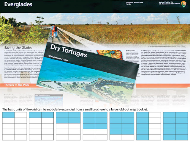
Regular page grids—and the module and program efficiency and consistency they create—are the core element of cost-effective design programs for larger enterprises. One of the most famous and successful design grid systems ever produced has been used by the National Park Service for more than thirty years. Massimo Vignelli’s Unigrid design system organizes and systematizes a huge array of park service paper publications (and now online pdfdocuments), from single-page brochures to large park maps and posters. Thanks to the strong, consistent Unigrid design program, the National Park Service has saved many tens of millions of dollars over the decades by not reinventing brochure and map design with every new print project (shown below).


Shown above is the National Park Service design grid for print publications. Thinking in a strategic, modular way about design can save a fortune in the long run.

Grids and templates on the web


Grids for page templates on the web are a more complex matter because the web is a fluid medium with many possible display conditions and a constantly changing technology base. The fundamental principles of consistent modular design programs still apply, but web page grids must necessarily accommodate a wider range of visual possibilities than their print counterparts. Print design grids are driven largely by fixed positioning and paper sizes. Web templates also create a regular, repeating structure of design patterns that consistently organize identity, navigation, content, and technical functionality, but they do it in a much more fluid, flexible medium than paper printing.

A good web template program establishes not just the visual look and feel of particular pages in the site but also specifies how regular patterns of xhtml,css, include files, and more complex application or content functionality will all merge using well-established, well-documented, and consistent standards throughout the site. And, like Vignelli’s Unigrid system, a good enterprise template system can save millions of design dollars that might otherwise be wasted in reinventing web publishing with each new corporate or enterprise site.

Templates and the enterprise


For maximum efficiency in web publishing, all large enterprises should have an existing, well-designed, well-documented set of web page templates that incorporate:

  • The global identity of the enterprise as an organized part of a larger enterprise identity program across all media
  • Global enterprise navigation features that tie smaller sites and programs to the larger institution
  • Well-designed, carefully validated xhtml and css code
  • Consistent semantic nomenclature for all xhtml and css containers and page elements
  • A consistent, enterprise-wide typography program
  • Accessibility standards that meet and ideally exceed requirements
  • Compatibility with, at minimum, a basic web content management tool such as Adobe Contribute or, ideally, an enterprise-wide web content management system
The Yale University page grids are a system of page formats in both fixed-width and fluid page forms. The templates define a consistent set of web identity, user interface, department identification, and typography standards for major university academic and administrative sites. The pages specify the locations of standard identification elements, content column widths, and a system of unique page element id nomenclature, and they provide a consistent set of typographic standards via a master set of enterprise-wide style sheets


Fixed and fluid elements in Yale University’s web template system.

Typography is a key element in template design


Consistent web typography has a huge but subtle effect on establishing coherence across a wide range of enterprise web sites. In a site with a strong typographic identity, most users will never explicitly notice why a wide range of related sites produces a cohesive web experience. Consistent web typography can bind those disparate sites in a way that still leaves enormous design flexibility to meet many functional needs and, with css techniques that use a master enterprise-type style sheet, is technically trivial to accomplish.

Reference: Web Style Guide by Patrick L

Posted on 10:41 PM | Categories:

Thursday, April 5, 2012

Old is no more Gold a.k.a Old vs New Browsers

Most of us don’t realize how much an old and out-of-date web browser can negatively impact our online lives, particularly our online safety. You wouldn’t drive an old car with bald tires, bad brakes, and an unreliable engine for years on end. It’s a bad idea to take the same chances with the web browser that you use daily to navigate to every page and application on the web.


Upgrading to a modern browser — like the latest version of Mozilla Firefox, Apple Safari, Microsoft Internet Explorer, Opera, or Google Chrome — is important for three reasons:

First, old browsers are vulnerable to attacks, because they typically aren’t updated with the latest security fixes and features. Browser vulnerabilities can lead to stolen passwords, malicious software snuck secretly onto your computer, or worse. An up-to-date browser helps guard against security threats like phishing and malware.

Second, the web evolves quickly. Many of the latest features on today’s websites and web applications won't work with old browsers. Only up-to-date browsers have the speed improvements that let you run web pages and applications quickly, along with support for modern web technologies such as HTML5, CSS3, and fast JavaScript.

Third and last, old browsers slow down innovation on the web. If lots of Internet users cling to old browsers, web developers are forced to design websites that work with both old and new technologies. Facing limited time and resources, they end up developing for the lowest common denominator — and not building the next generation of useful, groundbreaking web applications. (Imagine if today’s highway engineers were required to design high-speed freeways that would still be perfectly safe for a Model T.) That’s why outdated browsers are bad for users overall and bad for innovation on the web.


Not that anyone blames you personally for staying loyal to your aging browser. In some cases, you may be unable to upgrade your browser. If you find that you’re blocked from upgrading your browser on your corporate computer, have a chat with your IT administrator. If you can’t upgrade an old version of Internet Explorer, the Google Chrome Frame plug-in can give you the benefits of some modern web app functionality by bringing in Google Chrome’s capabilities into Internet Explorer.

Old, outdated browsers are bad for us as users, and they hold back innovation all over the web. So take a moment to make sure that you’ve upgraded to the latest version of your favorite modern browser.
The Browser Wars! In the past two years, IE has gone from commanding a 61.45 percent of the global browser market to 53.6 percent. In that same time frame, Firefox has dropped from 23.69 percent to 20.05 percent, while Chrome has gained considerable ground, climbing from 8.24 percent to 19.13 percent. According to StatCounter, things shake out a little differently. StatCounter has Chrome leading all other browsers with a 33.59 percent of the market at the end of August 2012. IE is close behind at 32.85 percent, followed by Firefox at 22.85 percent. Despite the abuse it routinely takes in tech and media circles, Internet Explorer is staging a bit of a comeback based on recent usage data.

While browser use is a product of many factors, Microsoft is taking on its competitor directly on another front: marketing. In recent years, Google has put a lot of marketing muscle behind Chrome, including web campaigns such as The Web Is What You Make Of It, with spots from Lady Gaga and sex columnist Dan Savage, as well as "Dear Sophie." Its top four campaigns have accumulated nearly 45 million views since 2009, according to analytics firm Visible Measures, but some are several years old at this point, while Microsoft is hitting the market with fresh work on the web and TV.

Last month, Microsoft launched a new TV ad for Internet Explorer that extols the speed and slickness of IE9 with excerpts of favorable reviews, and a shortened version of what's been published on YouTube appears to be in heavy circulation. The TV version of "A More Beautiful Web" premiered March 4 during AMC's "The Walking Dead" and has subsequently aired on "Mad Men." A Microsoft spokesperson said it's had a "broader broadcast and cable run" and has also aired during movie previews, in addition to its digital placements. The Final Takeaway Use a modern browser, first and foremost. Or try a new one and see if it brings you happier browsing that’s better suited to your needs. The web will keep evolving — dramatically! Support cutting-edge web technologies like HTML5, CSS3 and WebGL, because they’ll help the web community imagine and create a future of great, innovative web apps. Lastly, try new things. The web is a new and exciting place every day, so try tasks that you didn’t think could be done online -- such as researching your ancestry back ten generations, or viewing a real-time webcam image from a climbing basecamp in the Himalayas. You might be surprised by what you find!

 To check which browser you’re using, visit www.whatbrowser.org.
Posted on 11:12 PM | Categories:

Tuesday, January 31, 2012

Detecting Space in Input Boxes - CSS3 vs jQuery

It's 1 A.M and my half brother Jack from Utah pings me. Hey Ric, I got a webdesign issue that's keeping me awake. I paused for 2 minutes..assuming he is going to tell me more about the issue. But it seemed he was expecting me to solve it, whatever the issue is. So I being the nicest guy, asked him to mail me.

Here's the deal.


Jack wanted to find a space character in an <input> but using CSS3 selectors.Well, if you want to create an actual CSS3 rule in your stylesheet, then input[value*=' ']{..} will work, but only for values in the actual attribute (in the source code) and not the value as modified inside the browser..

For eg:

<form>
    <input type="text" value="no-space-here" /><br/>
    <input type="text" value="" /><br/>
    <input type="text" value="space here" /><br/>
    <input type="text" value="" /><br/>
    <input type="submit" value="submit"> type a space and press Submit
</form>

CSS

input[value*=' ']{
    background-color:#fff5f5;
}

Run the code here and see for yourself. http://jsfiddle.net/8BdUV/

A good solution is to use jQuery here


$('form').submit(function(){
    return ($(':input[value*=" "]').addClass('warning').length > 0) ? false : true;
});​

CSS

.warning{
    background-color:#fff5f5;
}

Now run the solution http://jsfiddle.net/PHja9/

Bingo!

Wednesday, January 25, 2012

Horizontal Navigation Menus


Horizontal menus are suitable for pages with menus containing fifteen menu buttons or fewer per row. Obviously, this depends on the length of the labels and the size of the text used on the buttons. With very short labels, more buttons could fit across a page (for instance, if the labels were page numbers 1, 2, 3, 4, etc.). The horizontal tab menus on the BBC web site has fourteen tabs in one row and two other rows with seven links on each. This shows that many more links can be fitted into a page if you can accept several rows. The rows need to be distinctly separated by a divider or by using navigation bars with different colors.


Horizontal menus can be challenging because the commonly advocated inline or float methods each have their problems. Floated menus can be difficult to center on the page, inline menus traditionally could not have equal size buttons. However, now that all the browsers support the muchneglected attribute { display:inline-block; }, horizontal menus are no more difficult than vertical menus, and dimensions can be very easily applied to give equal size buttons, or buttons that automatically vary to accommodate the content. Recipes for horizontal menus often use { display:inline: }, but the resulting buttons are unsatisfactory. All browsers now support { display:inline-block; }.

The attribute { display:inline: } did not allow width, height, margins, or padding to be set. By using { display:inline-block; }, buttons can be displayed inline and have their dimensions set. This provides the best of both worlds, as shown by the second row of buttons in the basic menu below.


The top row of this basic menu shows the unsatisfactory appearance of display:inline. In the second row, the display:inline-block buttons can be given height, line-height, and padding.

The very basic menus shown above are not a rollover menus; that is, they do not change color when the cursor hovers over the buttons. Also, they use paragraphs instead of the traditional unordered lists.

The code below contains two rows of menu buttons. The top row is unaffected by the CSS style sheet. The CSS style sheet, is linked only to the bottom row of  buttons and the style gives the text plenty of horizontal space. This demonstrates the value of the display:inline-block code compared with the default display:inline;.

Creating the Structure for Two Rows of Menu buttons

<!doctype html>
<html lang=en>
<head>
<title>Inline-block content</title>
<meta charset=utf-8>
meta details go here
<link rel = "stylesheet" type = "text/css" href = "inline-block.css">
</head>
<body>
<div id="container">
<p>&nbsp;</p>
<p>inline content (default)</p>
<p>
<a href = "#">Page 1</a>
<a href = "#">Page 2</a>
<a href = "#">Page 3</a>
<a href = "#">Page 4</a>
<a href = "#">Page 5</a>
<a href = "#">Page 6</a>
<a href = "#">Page 7</a>
</p><p>&nbsp;</p>
<p class = "inline-block">inline-block content<br>
<a href = "#">Page 1</a>
<a href = "#">Page 2</a>
<a href = "#">Page 3</a>
<a href = "#">Page 4</a>
<a href = "#">Page 5</a>
<a href = "#">Page 6</a>
<a href = "#">Page 7</a>
</p><p>&nbsp;</p>
</div>
</body>
</html>

The # symbol in the href items must be replaced by your own page URLs. The code here is the style sheet that targets the second row of menu buttons and applies the style display:inline-block; to enable the width of the buttons to be adjusted.

Applying the display:inline-block; Style to the Second Row of Buttons

/* Set styles to equalise the browser rendition*/
html, body, h1, h2, h3, h4, h5, p, ol, ul, li { padding: 0; margin: 0;
}
body { font-size: 100%; font-weight: normal;
}
ul { padding-left: 0;}
/* end of style equalisation */
p { background:white margin:auto; text-align:center;
}
#container { margin:auto; text-align:center; width:97%; min-width:800px; 
max-width:1200px;
}
a { background: orange; color:navy;
}
.inline-block a { display:inline-block; width:110px; height:30px; 
line-height:30px; text-align:center;
}

Here's a Demo


Posted on 7:46 PM | Categories: ,